
At the intersection of creativity and data
Brand strategy and graphic design for companies looking to uncover what makes them mighty.
We help those doing good work share their unique personality and purpose through powerful words and images. We help the purpose-driven, the disruptors, the challengers.
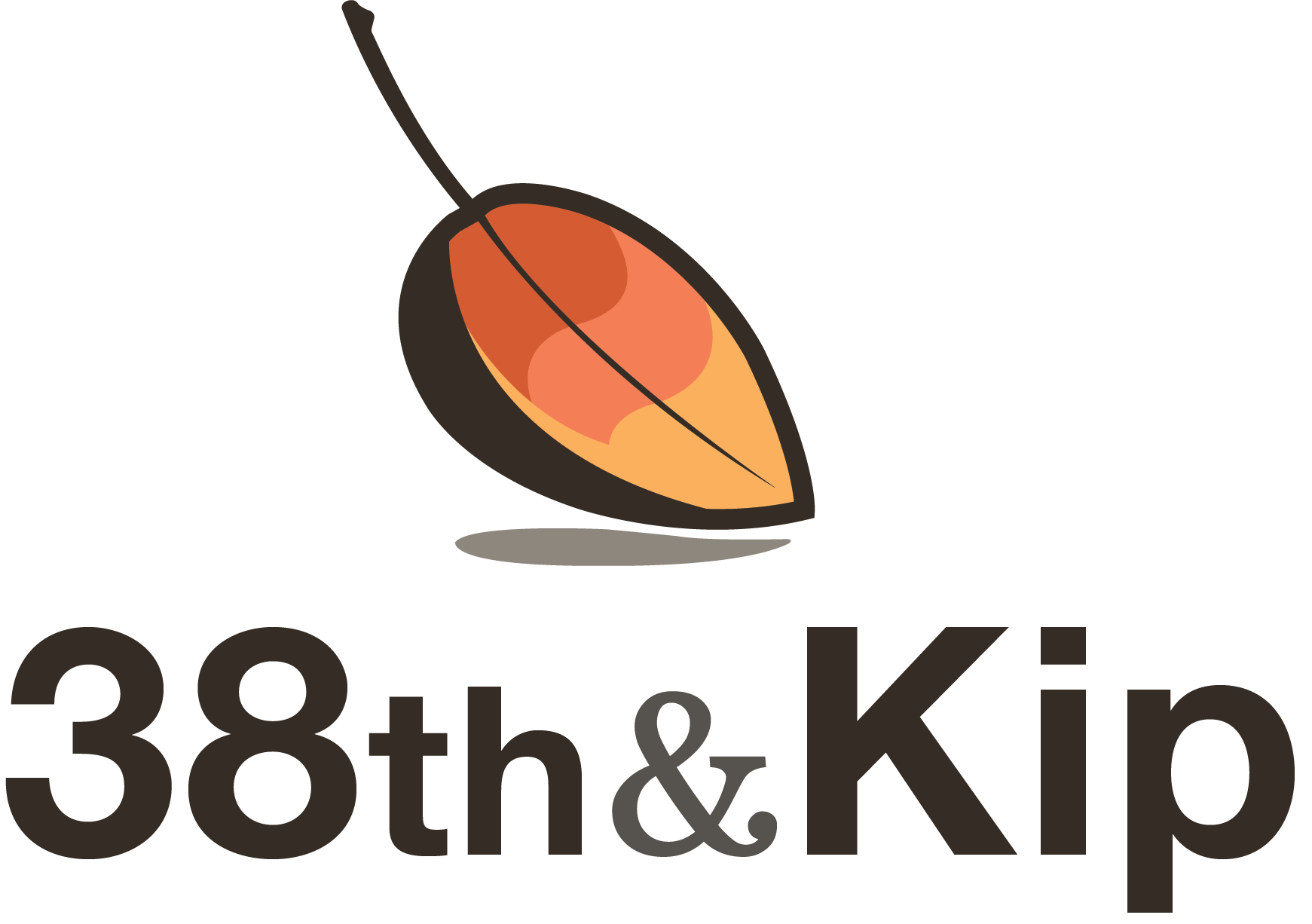
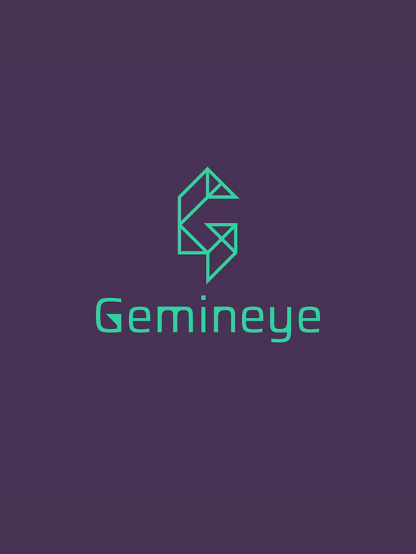
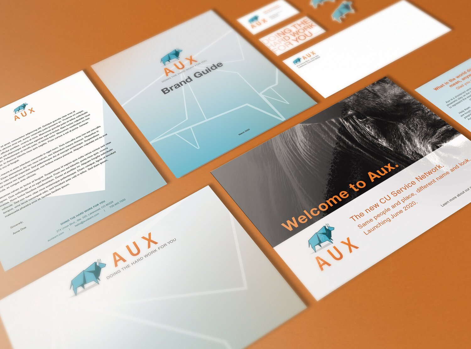
Recent Projects


Our Services
Branding
Brand strategy | Company Naming | taglines | Personas | brand story
We help you discover what you do, why you do it, and who you do it for, and then translate those findings into actions using proven methodology and data.

Identity & Graphic Design
Logos | identity kits | Brand Guidelines | collateral | design systems
Rooted in fine art principles, we look to the past for design mastery, but to the future for contemporary inspiration. Good design is backed by sound reason, and is never arbitrary.
Illustration
Products and services visuals | custom icon packs | infographics | events
Unique visuals drawn by people are more important than ever in an age of A.I. Stand out from your competition with visuals that are yours, and only yours.

“Alicia Disantis and her team at 38th & Kip did an outstanding job in working with the nonprofit organization I manage. Throughout the course of several months last year, she helped to redesign our logo and provided input on elevating our brand in the language education industry.”
Friends and Partners


Videos and Tutorials
Doin’ it for the ‘Gram

View fullsize
![]()


View fullsize
![]()

View fullsize
![]()


View fullsize
![]()

