
Space Bucket Brand Identity and Custom Illustration
Space Bucket is a digital marketing agency concept that specializes in real estate and leasing. It’s a welcoming, nostalgic brand that packs a punch and stands out from the crowd.
Client: Genius Digital Marketing
Lead: Alicia Disantis
Brief: The goal was to create a digital marketing agency brand that was totally unique in a crowded marketplace, and one that spoke to the niche, but booming, real estate market. The client asked for a brand that incorporated three words: Bold, Hand-drawn, 90s. They also requested a series of hand-drawn illustrations to represent each of their agency’s services in a nostalgic way.
The brand’s foundation was the concept of “space,” hence the name Space Bucket. A play on the business of space - aka real estate - was central to the name and visual identity: “outer space,” “interior space,” “your space.”
We were asked to create Space Bucket’s:
Logo identity
Color palette
Website mockups
A series of product-specific, hand-drawn illustrations used for digital iconography and product positioning
Challenge: Creating a brand that way just playful enough to reflect the brand personality and voice, but not too playful to be seen as flippant in a very serious industry. Walking the fine line between nostalgic and not sappy, memorable but not kitche, fun but not unprofessional.
Secondly, creating a series of illustrations that used an analog theme to represent a very digital service. How do you illustrate the concept of SEO, but with a 90s theme?
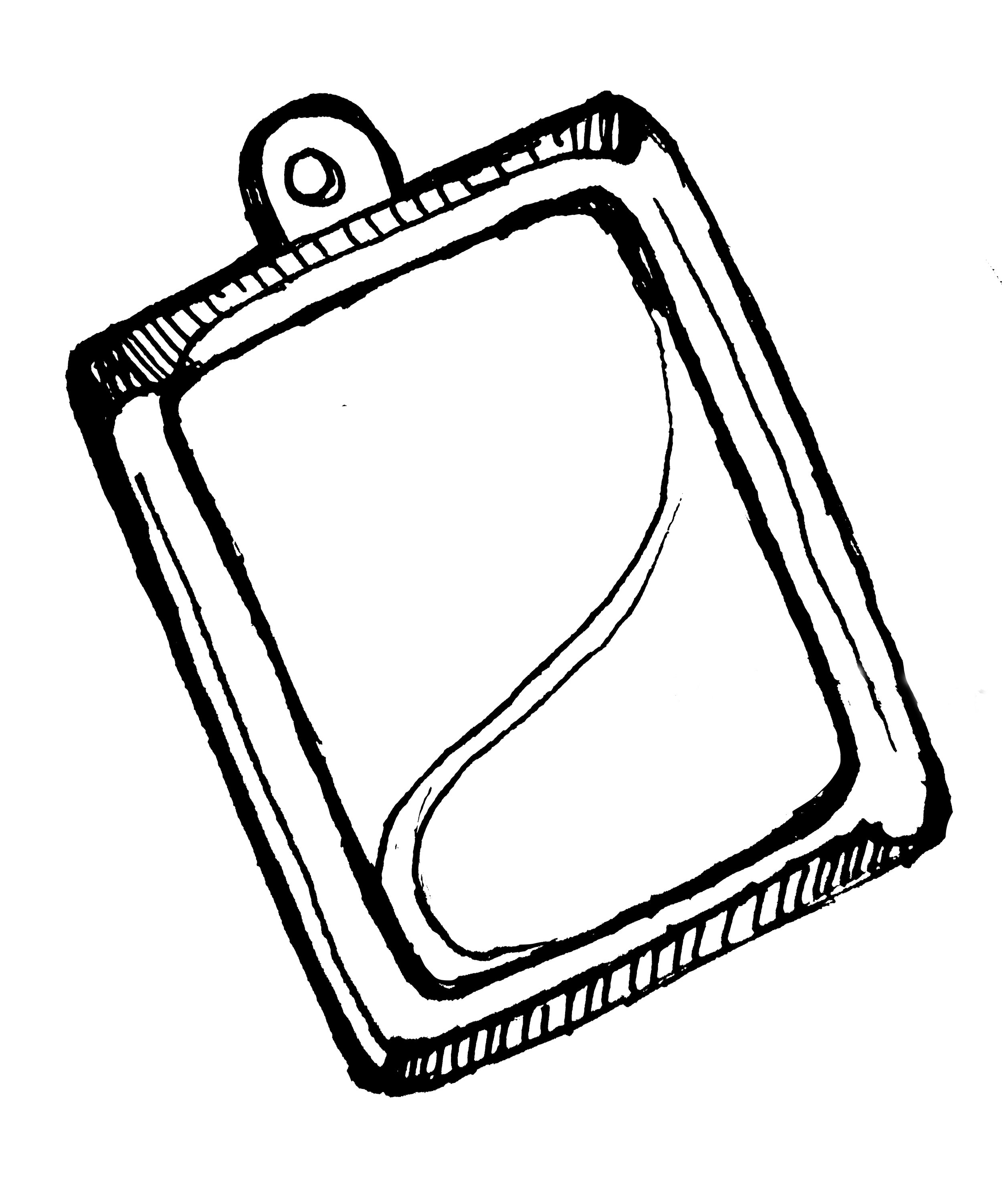
The Space Bucket Logo
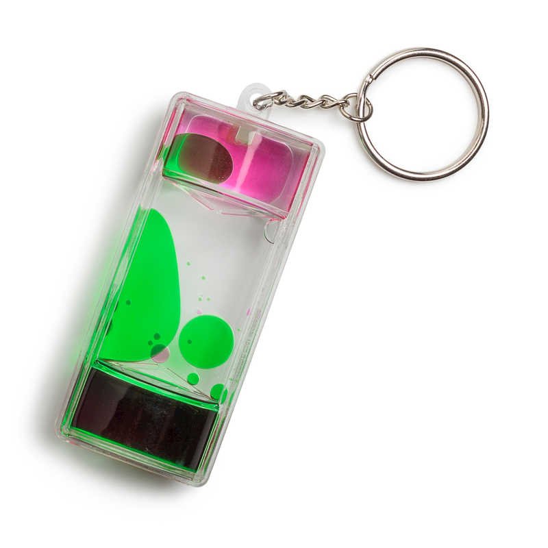
What’s better to represent real estate than a keyring? Instantly recognizable, nostalgic, and flexible in design, the concept of a keyring with memorable items, including a liquid keychain with the agency’s name proudly displayed does the trick. Who could forget the good ol’ days of entertaining ourselves with kitschy keychain toys, well before the internet and smart phones?
The beauty of this design is that the keychains can be swapped out based on any variety of business/product situations - like a special event or partnership.
The final visual component to complete the logo was the hand-drawn aesthetic. Elements were drawn one-by-one, scanned in, and digitized, creating a uniquely analog look. Even the typography was traced over by hand.
A 90s-themed color palette accompanied the core brand logo colors.


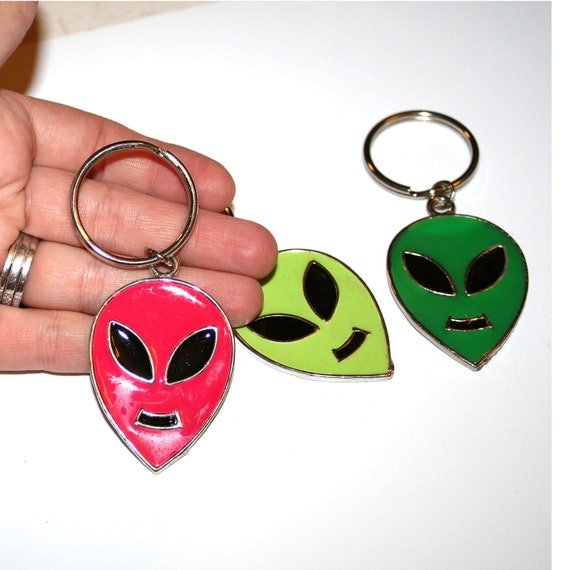
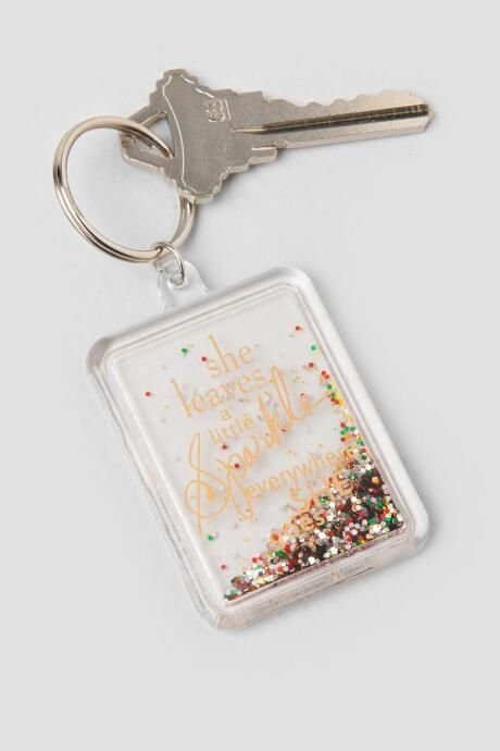
90s and Y2K Creative Inspiration


Illustrations
We created a series of eight illustrations to represent each of Space Bucket’s digital marketing services. One of the most challenging components of the project was translating a digital solution in an analog way.
We asked ourselves - what was memorable from this time period? What evoked powerful and happy emotions from Millennials and Gen Xers? And how could we translate these snapshots and apply them to a service?


